
Typographic Hierarchy
One of the most important techniques for effectively communicating (or “honoring”) content is the use of typographic hierarchy. Typographic hierarchy is a system for organizing type that establishes an order of importance within the data, allowing the reader to easily find what they are looking for and navigate the content. It helps guide the reader’s eye to where a section begins and ends, whilst enabling the user to isolate certain information based on the consistent use of style throughout a body of text.
“Typography exists to honor content.”
- Robert Bringhurst: The Elements of Typographic Style
A Simple Example
Let’s look at an example of content with and without a designed hierarchy.
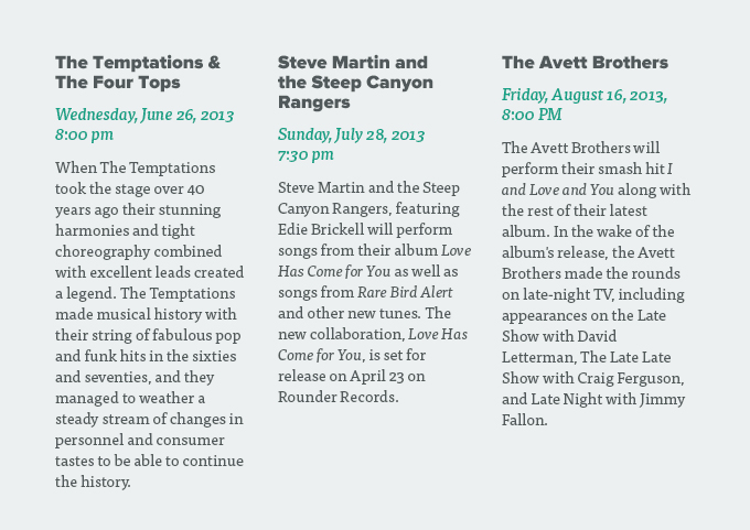
The image below is a list of concerts playing at the outdoor venue down the street from my house. For the sake of this example, let’s say I’ve got the weekend of August 15–17 free, and I want to see if there’s a concert I’d like to attend around that time. In the scenario below, this is a task that’s much more difficult than it should be. Without any type of hierarchy, one has to sift through much of the data to find the dates to the concerts. Just imagine trying to look through a list of 50 concerts.

Ok, so maybe I’m being dramatic in the example, but we can make this much easier.
As you can see in the next example, the title, date, and descriptions are all styled uniquely, consistently and isolated by using paragraph spacing. This allows us to easily isolate the dates (or band names for that matter) based on the styling, plus we can get at the information we need. Looks like we’re going to the Avett Brothers show!
Hierarchy and the Web
It should be pointed out that when designing for the web, there’s another layer to take into account. A webpage itself has a hierarchy that not only is read, but contains interaction. The page as a whole must be designed in a way that clearly communicates to the user what actions are available and how to easily access the information they seek, how to purchase an item, etc.
For the purpose of this article, however, we’re talking strictly about hierarchy as it applies to type. Luckily for us, we have our own handy HTML tag that lets us semantically establish typographic hierarchy into the websites we build. Heading tags (H tags) allow us to specify an order of importance into our content: H1 through H6, H1 being most important, H6 being least. Search engines use this data to interpret priority of content on a webpage.
But how do we effectively style those H tags in way that makes sense with our content? Glad you asked!
Styling Techniques
There are a few basic methods for establishing a visual typographic hierarchy:
- Size
- Weight
- Color
- Position
- Type Contrast
Most commonly these methods are used in combination with each other. In the concert list shown earlier, size, color, spacing, and type contrast were all used. The combinations are literally endless.
Size
This is the easiest and most common method for establishing hierarchy.

Weight
Simply using a bolder weight of a font can help isolate.
Color
Color plays a big role in what our eye sees as primary and secondary. Generally speaking; warm colors pop, cooler colors recede.

Position
Where sections of information are positioned in relationship to each other can establish a hierarchy.

Contrasting Typefaces
A great way to achieve hierarchy is to use contrasting typefaces.

Combination
As mentioned previously, these methods can be most effective when used in combination with one another. This is the fun part – deciding what combination is right for your content and layout!

Spacing Matters
One of the most important concepts in type design is spacing. It’s one of the most difficult concepts to grasp for beginning designers, yet it is also one of the most visually obvious. Proper typographic spacing is critical in establishing hierarchy; it can make the difference between confusion and clarity. It is used in the majority of hierarchical systems, and it is present in all of the examples in this article.
The rule of proximity in design generally states that related items should appear closer to each other than items that are not related. However, proper spacing involves more than just a hard return between sections of type. Generally, a hard return creates too much space between content in the context of a paragraph. Paragraph spacing – either before or after – should be used. I tend to use paragraph spacing that is equal to half of the line-height (or leading). This typically allows the group of content to hold together while providing an adequate division of content within it.
Other Considerations
It’s important that the meaning of a particular piece of content be taken into account when thinking about hierarchy. What is the subject matter of the content? What is it trying to communicate? If you don’t know, read it before making decisions on hierarchy and style.
In some scenarios, you may have the freedom to employ any of the hierarchy methods listed above, but in other cases you may be limited to a certain vertical or horizontal space or be concerned with adequate contrast of type on a background. Evaluate which methods work for the situation, and employ the ones that make sense. The old “simpler is better” mantra usually applies here. Remember, the goal is to present the content in an organized way.


